Check out this list of the top 18 Facebook ad examples from eCommerce businesses around the globe and get inspiration from the greats.
True artists take inspiration from the world around them - and the same goes for those of us looking to create high-converting Facebook ads.
In this post, we'll cover 18 of the best Facebook ad examples from companies around the world who are crushing their competition.
We'll also give you best practices and resources for creating your own, too.
Let's get to it!
What makes a Facebook ad 'good'?
Before we cover the examples, it's important to take a moment to think about what makes an ad 'good' in the first place. Overall, there are several factors you should be thinking about when looking at an ad:
Is the creative of good quality?
Your creative (or ad graphic) tends to be one of the first things that will get your ad noticed by your audience. This means that your graphics have to adhere to the same high standard as your ad copy.
In some cases, having a bad quality design could even make or break a sale.
Case and point: which one of these ads would you trust to give your personal details to?
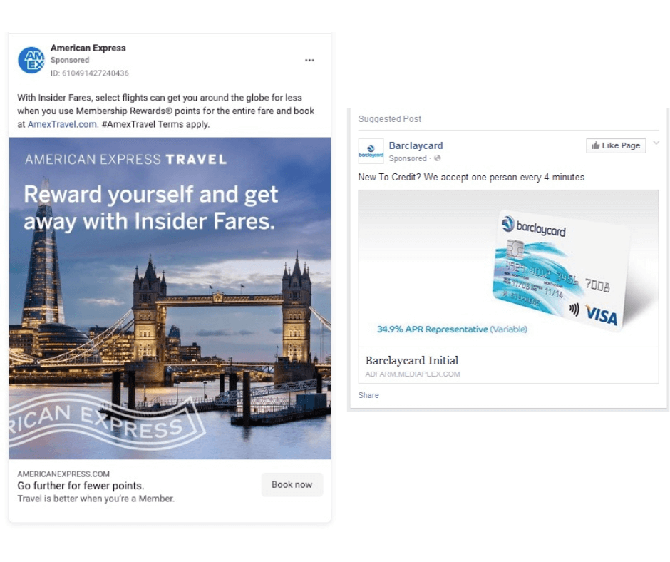
When it comes to creative, you should always think about:
- The goal of the ad itself (clicks, video views, conversions) and which ad format makes this action, well, more actionable
- The overall brand coherence (if the creative retains your brand's overall theme and design)
- If the image or video is low quality or looks 'scammy'
Given that there's an array of ad types (that we'll be getting to in just a moment), it's imperative to consider not only the message you're trying to convey but also the medium that you're using to spread the message.
For example, if you're looking to explain how your product works, a video may be a better choice than a static image. If you'd rather display several of your products, single-image carousel ads give you a better way to showcase each and every one.
Note: Not every team has a full-time graphic design service available, which can make creating high-quality ads difficult, to say the least. However, with Madgicx's Sparkle, you can have an on-demand design team that can create an unlimited amount of graphics for a flat monthly fee.
Now that we know what things to look for in our ad, it's time to sit on our throne of judgment and see the top 16 Facebook ad examples in 2022.
Is the ad copy clear, and does it explain the offer or call to action?
Text is one of the first things that people will notice about your ad. While many people focus most of their time on just the primary text, the reality is that there are several places in which your ad copy appears within an ad.
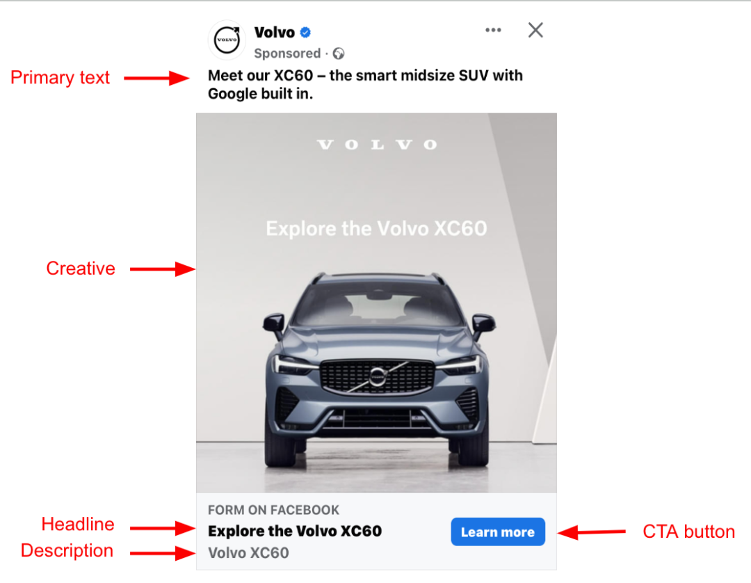
Each part of the ad copy has a specific job to do and helps explain and reaffirm your offer or the focus of the ad.
When creating ad copy, there are several important things to tick off your checklist:
- Does this ad speak to my audience by using the same terms and language they do?
- Does this ad clearly communicate the offer at hand?
- Does this ad tell the viewer how to take the next step?
If you can't give a definitive answer to any of these questions, you need to review and rewrite your ad copy so that it meets these criteria.
We know writing good ad copy is tough, which is why we have a complete guide on how to write killer ad copy here if you need some tips.
Let's hop to it!
Facebook photo ad examples
1. Canva
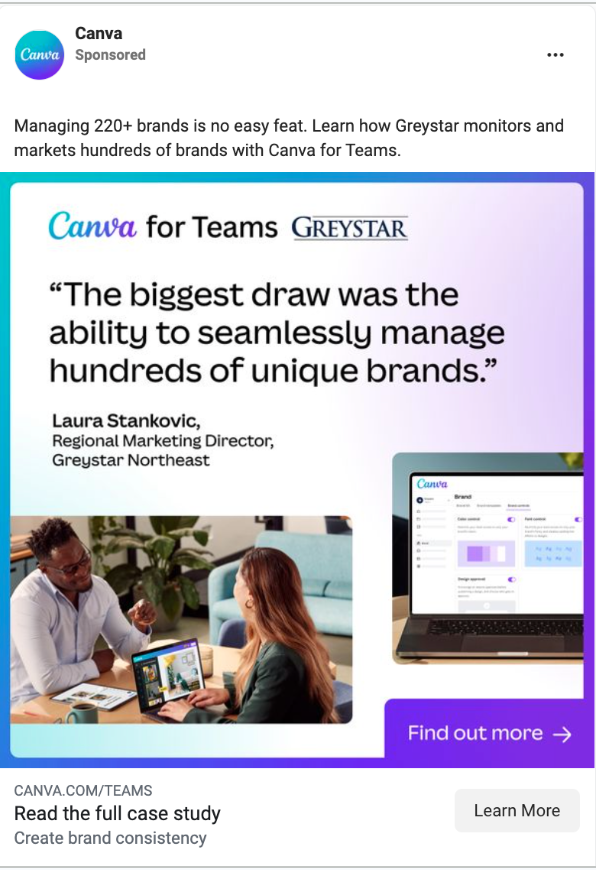
Yup, customer testimonials are still the strongest proof point! And this Canva ad proves this in more ways than one.
Why it works:
I. Credible testimonial: The ad includes a powerful quote from the regional marketing director at Greystar. Her prestigious job title and the mention of her company's name reinforce the authenticity and credibility of the testimonial. It's not just a random endorsement but a real recommendation from a professional in a significant position.
II. Double call-to-action: Canva doesn't settle for one CTA; it doubles down with two. There are two clear calls to action – the first one cleverly embedded in the creative itself, enticing users to take immediate action.
The second is the conventional CTA button, providing users with a double nudge to explore further. This strategic approach increases the chances of user engagement and conversion.
III. Case study emphasis: The ad doesn't just stop at the testimonial; it pushes users to delve deeper into the product's success through a case study. By directing potential customers to a detailed case study, Canva goes beyond mere claims, providing tangible proof of its product's effectiveness. This not only informs but persuades, offering a more comprehensive understanding of how Canva delivers value.
2. Vinted
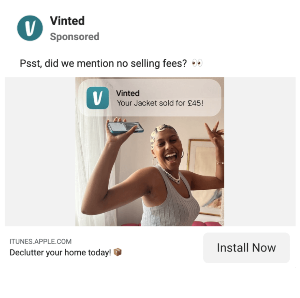
You know that joyous feeling you get when your phone pings with a bank notification, announcing money in your account? Vinted gets it and captures it perfectly in their ad.
Why it works:
I. Dopamine-inducing success: Vinted doesn't just showcase a transaction; it unveils the sheer delight of seeing money enter your account unexpectedly. The ad taps into that unique thrill, that surge of joy when your efforts pay off.
II. No hidden fees transparency: The post copy keeps it short, sweet, and direct. In a world where hidden fees can be a major turnoff, Vinted is upfront about its advantage. The transparency about no selling fees adds a layer of trust and simplicity to the platform, making it even more appealing.
III. Compelling headline: "Declutter your home now." Vinted doesn't just focus on selling; it offers a passive yet desirable benefit – the opportunity to declutter while earning cash.
3. Pienaar & Son Distilling Co.
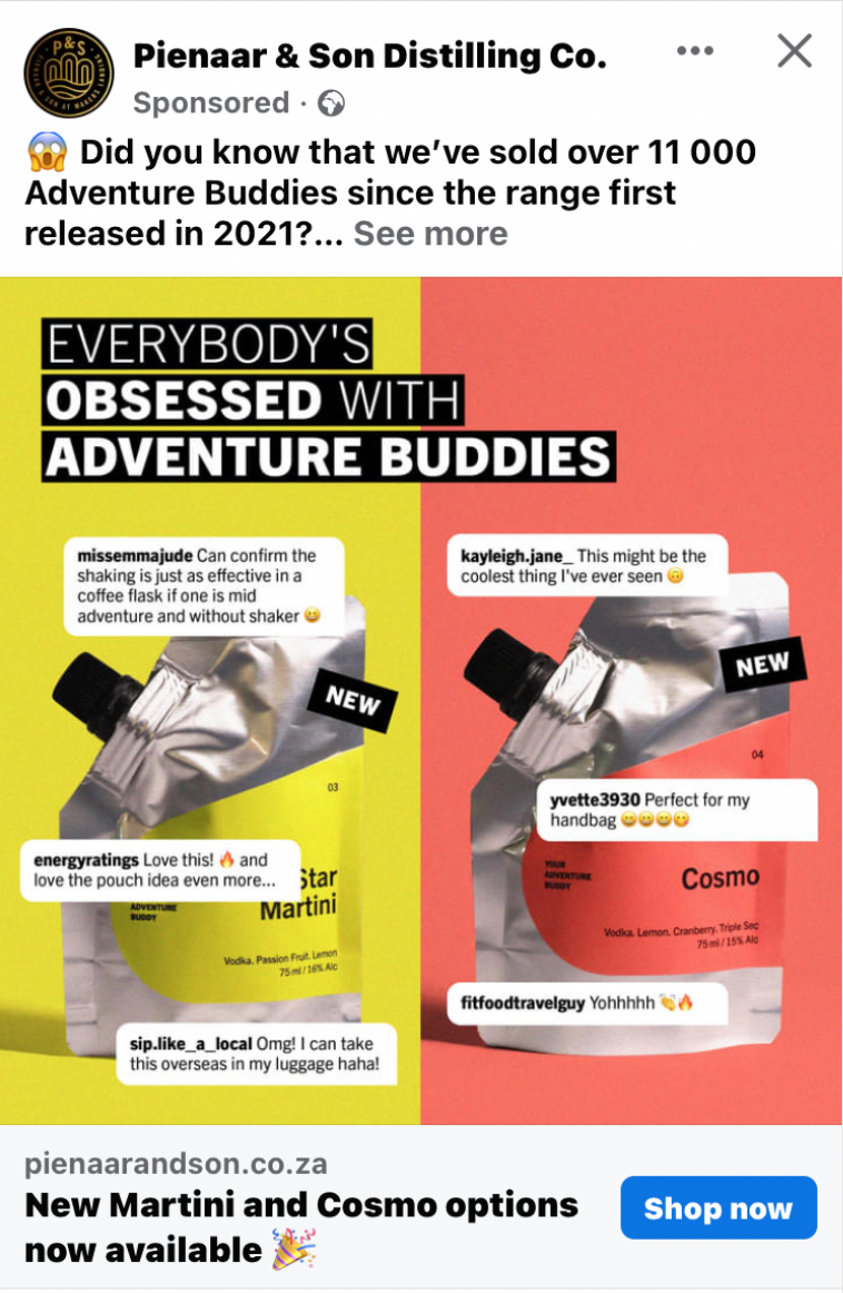
A Cosmo and Martini on the go? Yes, please! This isn't just a nifty product for adventurers; it's a sweet ad for a couple of compelling reasons.
Why it works:
I. Fear of missing out (FOMO): Remember the power of a customer testimonial? Pienaar & Son takes it to the next level by featuring screenshots of comments they've received on social media, complete with the handles. The inclusion of real people's comments and emotions gives potential customers a glimpse of what current customers are enjoying, creating a sense of urgency to try it for themselves.
II. Bold text: That big, bold type is hard to miss. Pienaar & Son knows the importance of making a statement, and the bold type ensures that the message is seen and remembered. It's a visual cue that demands attention and sets the tone for the entire ad.
III. Captivating design: Taking cues from the bold type, the ad employs bright color-blocking and a split-screen, side-by-side showcase of the two flavors. This design choice isn't just visually appealing; it's captivating. It draws you in, highlighting the product's vibrancy and variety.
4. The Ordinary
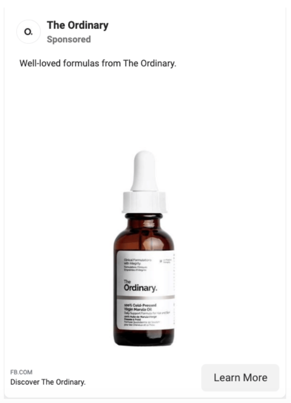
Notice how your eyes gravitated straight to the bottle? That's the power of negative space.
Why it works:
I. Minimalism: Consumers are constantly bombarded with visual noise, The Ordinary cuts through the clutter by embracing minimalism. The stark white background and the solitary presence of the product create a visual oasis, allowing your potential customer to give undivided attention to what truly matters – your product.
II. Simple and straightforward: No image text, no price tag, no fluff. The Ordinary lets the product speak for itself. The simple post copy and absence of distracting details are intentional, offering an opportunity for the product to take center stage.
III. Distinction: In a culture where more is often considered better, The Ordinary stands out on image and text-heavy feeds. They’re proving that sometimes, less is not just more – it's everything.
5. Starbucks
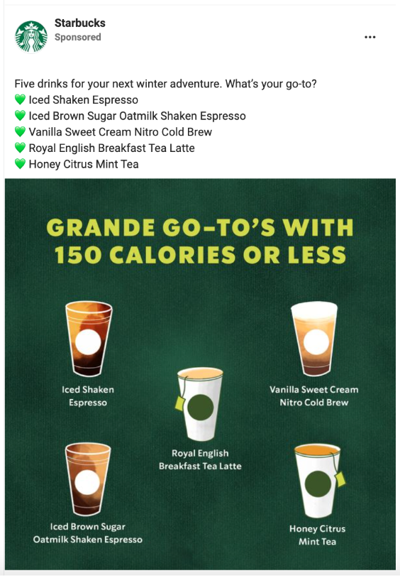
In a refreshing departure from the norm, Starbucks boldly blends not one but five delectable drinks in a single image ad—something we don’t see often in coffee ads.
Why it works:
I. Product showcase: Why settle for showcasing one when you can entice with five? Starbucks taps into the abundance of its menu, showcasing a variety of drinks in one ad. This strategic move serves as a mini product catalog, appealing to a broader audience in a single glance.
II. Health-conscious appeal: With the wellness trend steadily on the rise, Starbucks takes a smart approach by highlighting that all five drinks boast 150 calories or less.
This snapshot not only caters to the visually inclined but also makes it easier for those mindful of their calorie intake to learn about more delicious options.
III. Engagement increase: The ad doesn't just stop at visual appeal; it invites interaction by including a question. Starbucks anticipates an engagement boost as coffee enthusiasts eagerly share their personal favorites, turning the ad into a platform for the community to express their unique tastes.
Facebook carousel ad examples
6. Gymshark
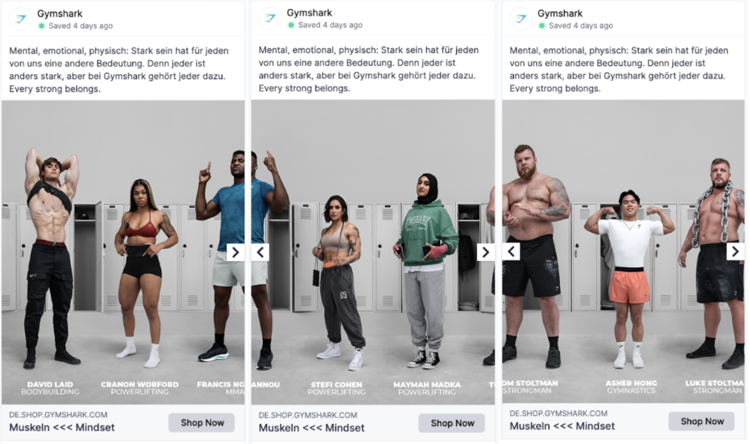
Gymshark, the go-to brand for men's and women's gym clothing, takes a bold leap in their latest ad campaign. Breaking the conventional norms, they feature seven diverse athletes in one captivating horizontal image, strategically sliced into several slides.
Why it works:
I. Unconventional presentation: Gymshark disrupts the ordinary by breaking down one long horizontal image into multiple slides. This turns a simple concept into an interactive experience. The dynamic flow, starting with bodybuilder David Laid on the left and concluding with strongman Luke Stoltman on the far right, creates a seamless visual journey that keeps you engaged.
II. Product showcase on diverse bodies: Beyond the visual intrigue, the ad ingeniously showcases Gymshark products on a spectrum of diverse bodies and athletes.
Each athlete represents a unique facet of strength and fitness, emphasizing Gymshark's commitment to catering to every body type and fitness discipline.
III. Simplicity with impact: The simplicity of the concept is its strength. Gymshark doesn't need elaborate graphics or flashy effects; the power lies in the diverse representation of athletes and the products they wear.
7. Destinations by Frasers
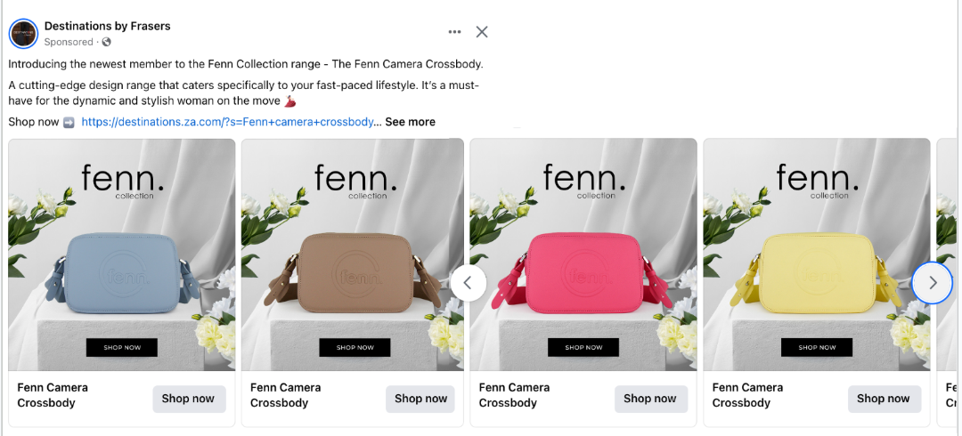
This carousel ad cleverly aims to appeal to many.
Why it works:
I. Personalized appeal: The variation of colors caters to a wide range of personalities. Whether you're drawn to the serene blues, vibrant pinks, or sunny yellows, there's a color to match every individual's taste and mood.
II. Surprise element: The unexpected range of colors not only keeps viewers engaged but also adds an element of excitement and discovery with every swipe.
8. Accor Live Limitless
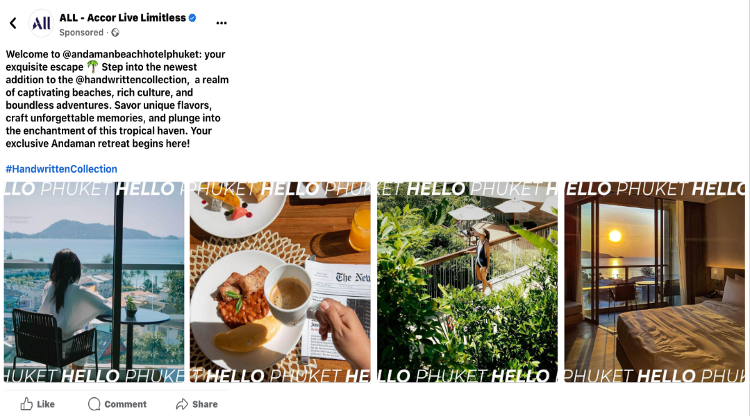
Accor Live Limitless invites you to a visual journey through their Phuket retreat with a captivating carousel ad. Each slide unfolds a different moment, painting a vivid picture of what a day at this luxurious resort could look like.
Why it works:
I. Storytelling: The carousel ad becomes a storytelling canvas, beginning with a woman in her hotel room, gazing at the breathtaking view. This opening shot sets the tone, instantly immersing the viewer in the allure of a luxurious getaway.
II. Tangible experience: Transitioning seamlessly, the second slide invites you to breakfast, offering a glimpse of the resort's sumptuous dining experience.
III. Discovery The third slide takes you beyond the confines of the hotel. It introduces the element of exploration, suggesting that a stay at this retreat isn't just about the comforts of the hotel but also about connecting with the natural beauty surrounding it.
IV: Conclusion: The carousel concludes with the woman now back at her hotel which overlooks a mesmerizing sunset. It invites viewers to imagine themselves basking in the magic of a day well spent.
9. Honest Greens US
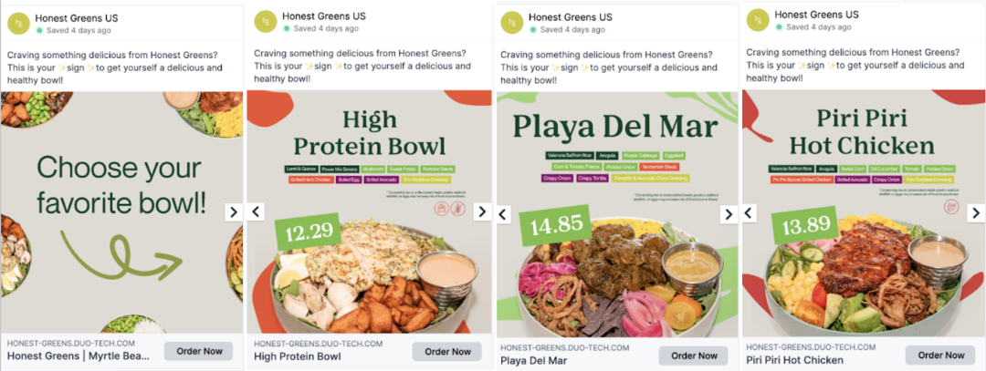
Honest Greens mimics the ordering experience with a carousel ad that mirrors the simplicity and familiarity of flipping through a menu.
Why it works:
I. Intuitive menu browsing: The carousel format mimics the real-life act of flipping through a menu, creating an intuitive ordering experience. Users can swipe through each card, just as they would in a physical menu.
II. Comprehensive information: Each card provides a comprehensive snapshot of the plated menu item. From price to a detailed description of the meal, users have all the necessary information at their fingertips.
III. Effortless ordering: The inclusion of a direct link to order each menu item adds a layer of convenience, making it easy for customers to convert their browsing into a satisfying meal.
10. Ford
Ford ingeniously employs a carousel ad that takes you on an immersive journey through the intricacies of their exceptional car. Each slide focuses on a distinct feature and highlights what makes it special.

Why it works:
I. Feature showcase: The carousel format serves as a canvas to showcase the car's features in detail. Starting with the full car, it progressively zooms in on specific elements like lights, alloy wheels, and parking sensors. This strategic presentation allows viewers to appreciate the car's design and functionality, creating a visual narrative of its excellence.
II. Unique selling points: With each slide, Ford strategically emphasizes the unique selling points of the car. Whether it's the cutting-edge technology of the lights, the sleek design of the alloy wheels, or the convenience of parking sensors, each feature is presented as a standout quality.
III. Call-to-action: The ad concludes with a call-to-action to convert interest into action. This encourages viewers who have been captivated by the features to take the next step in their journey— obtaining a quote.
Facebook stories ad examples
11. KLM Royal Dutch Airlines
Brace yourself! Because KLM is taking you on an adventure in 20 seconds 🛫
Why it works:
I. Immersive entrance: In this ad, the airplane door opens, and our friendly flight attendant invites you in. Sound familiar? It's not just an ad; it's an immersive experience that makes you feel like you're about to fly, just like in real life.
II. Dynamic destinations: The ad takes you on a whirlwind tour of sought-after destinations. It's a virtual voyage that encapsulates the joy of exploring diverse destinations.
III. Farewell with a smile: As your journey concludes, the flight attendant bids you farewell, closing the giant door behind you. It's a blend of the virtual and the real, leaving you with the warm afterglow of a real travel experience.
12. Yacht Week
This ad takes you on a FOMO-inducing journey.
Why it works:
I. Sunrise to sunset excitement: Yacht Week captures the essence of a thrilling day. The ad unfolds like a story, taking you on a journey through the highs of daylight to the vibrant energy of the night.
II. Dynamic editing: The scenes are quick, dynamic, and high energy, defining the spirit of Yacht Week.
III. Drone magic: The use of drones adds a mesmerizing touch, flying and zooming across all the yachts. This aerial perspective captures the vastness of the experience.
13. Jeep
Ever wondered if a still image could come alive? Jeep has cracked the code! Behold the brilliance of photo motion effects.
Why it works:
I. Breathing life into images: Witness the magic as a static image transforms into a vibrant video. The car lights start blinking, adding a touch of realism that captivates without the need for an entire video production.
II. Cost-effective: Jeep's ingenuity lies in its ability to create a visually engaging experience without breaking the bank. By utilizing photo motion effects, they've slashed video production costs and time.
III. Repurposing brilliance: Jeep demonstrates the power of repurposing existing high-quality images. With photo motion effects, every image you have becomes a versatile asset.
14. Cartrack
In Cartrack’s new ads, authenticity takes the wheel. They’ve gone the user-generated video route, No overproduction, no polished scripts, just real stories from real people.
Why it works:
I. Authenticity: Cartrack's lo-fi, user-generated video featuring a new customer is a breath of fresh air in a Story feed dominated by polished productions. The authenticity shines through, making it relatable and credible. Her genuine voice and real experiences resonate more than any scripted sales pitch.
II. Real experiences: The customer candidly shares the key factors that led her to choose Cartrack. It's a real customer making an informed decision based on a genuine experience.
III. Credibility: Lo-fi UGC videos like these are a testament to Cartrack's confidence in their service. By letting customers like her speak for the brand, they become more personal and amplify their credibility.
15. Recoveries by Cartrack
In this Story image ad, Cartrack's Recoveries division brings a dash of humor to the serious business of keeping your vehicle safe.
Why it works:
I. Witty messaging: The clever play on "car thieves get these for free" adds a light-hearted touch to the serious topic of vehicle security. It's a witty way of emphasizing the effectiveness of their tracking system in deterring thieves.
II. Memorable visuals: The image of handcuffs adds a memorable visual element to the ad. It deviates from the norm of using a vehicle when advertising tracking systems.
Facebook video ad examples
16. Mirari Gin
This Meta ad by Mirari Gin is enough to make a fish thirsty 🍸🌿
Why it works:
I. Mixology masterclass: The close-up shots of hands skillfully crafting gin drinks provide an immersive view into the art of mixology. It's a visual showcase of expertise, precision, and the passion that goes into every crafted sip.
II. Thirst-inducing imagery: The video serves as a demonstrative feast for the senses with refreshing fruit shots, adding a burst of vibrant colors and flavors to the mix. The carefully curated shots leave you yearning for the refreshing sip of the meticulously crafted drinks.
17. KitKat
Ever heard of scroll-stopping content? KitKat not only knows it but excels in it.
Why it works:
I. Unconventional visuals: KitKat's mastery lies in turning the ordinary into the extraordinary. By shooting the product unconventionally large on your screen, they create a disruptive visual experience. The extreme close-up of the chocolate breaking challenges the typical portrayal of chocolates in ads, making it unmissable.
II. Playful call-to-action: "Take a (scroll) break" – a simple, yet playful call to action that tempts you to pause and savor a KitKat moment. The parenthesis around "scroll" adds a clever twist, subtly nudging you to break not just the chocolate but the scrolling routine.
III. Consistent branding: KitKat's consistently bright red background is a stroke of branding genius. It ensures that their ads are instantly recognizable.
18. Walmart
Don’t be afraid to deviate from your brand norm from time to time. Walmart takes a delightful leap into the world of animation, creating an adorable ad that is a strategic move to captivate its audience.
Why it works:
I. Unexpected animation: Walmart breaks away from the expected with a charming animated ad. Animation adds an element of surprise and delight. It's a refreshing departure that captures attention, making the ad memorable for existing and potential customers alike.
II. Focus on human truth: The ad smartly taps into a universal truth – human impatience and the desire for instant gratification. By highlighting last-minute gifts and same-day delivery, Walmart not only addresses a pain point but turns it into a selling point.
III. Strategic messaging: Focusing on last-minute gifts and same-day delivery is a strategic move. Walmart is playing into the human tendency for procrastination and the urgency for quick solutions. The messaging aligns with real-life scenarios, making the brand more relatable.
…and that’s a wrap!
Today we’ve given you 18 of the top Facebook ad examples, including video, carousel, and photo ads that you can take inspiration from. With these in mind, you can now create your own ads that are eye-catching and, most important of all, high-converting.
If you’re looking for even more examples, you can always use the Facebook ad library to search through ads from your competitors.
Don’t have the resources to make killer Facebook ads? Give Madgicx's Creative Workflow a try. Begin by drawing inspiration from top-notch ads in Madgicx’s Ad Library, then submit a brief, and watch our skilled designers turn your vision into captivating ads—affordably!
Digital copywriter with a passion for sculpting words that resonate in a digital age.




.png)
